How to Choose the Right Chart
The wrong chart can hide great data. This guide, based on the ChartBar cheat sheet, starts from what you want to show and points you to the right chart type.
Start with the question: what do I want to show?
- Compare values across itemsBar chart, ranked table
- Show change over timeLine chart
- Show share of a wholePie or donut chart
- Look at two dimensions at onceCrosstab, heatmap
- Highlight one value or progressGauge, waffle chart
- Rank changes, before/after, actual vs targetCombo charts (bump, dumbbell…)
- Show geographic patternsChoropleth map
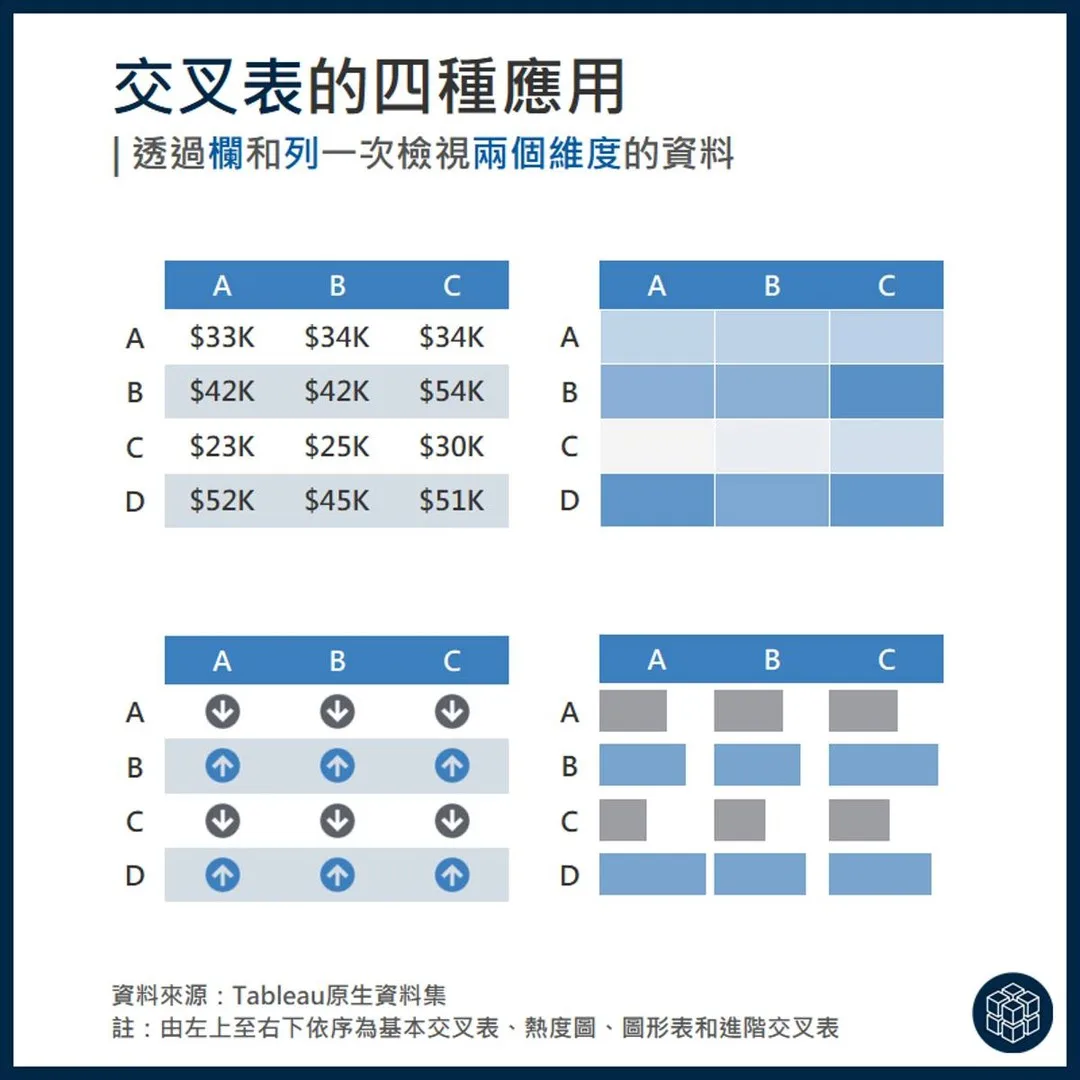
Crosstab
View two dimensions at once through rows and columns
Four common variants
Basic crosstab, heatmap, symbol table, advanced crosstab
Best for
When readers need exact numbers and patterns, e.g. region × product sales.
Common mistake
Too many cells in one color forces cell-by-cell reading. Use heatmap shading to surface what matters.
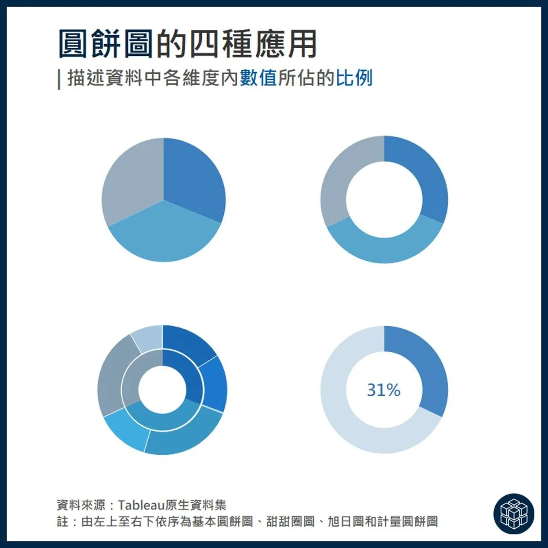
Pie chart
Show how each item contributes to the whole
Four common variants
Basic pie, donut, sunburst, gauge pie
Best for
Few categories (ideally 5 or fewer) that add up to a meaningful 100%, like market share.
Common mistake
With many or similar slices, angles are hard to compare — a bar chart is clearer.
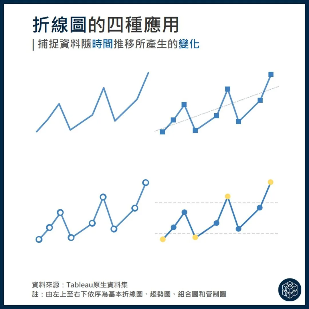
Line chart
Capture how data changes over time
Four common variants
Basic line, trend line, combo, control chart
Best for
The x-axis is continuous time and you want trends, seasonality or outliers. Control charts flag points beyond limits.
Common mistake
Connecting unordered categories (like cities) with a line implies a trend that isn’t there.
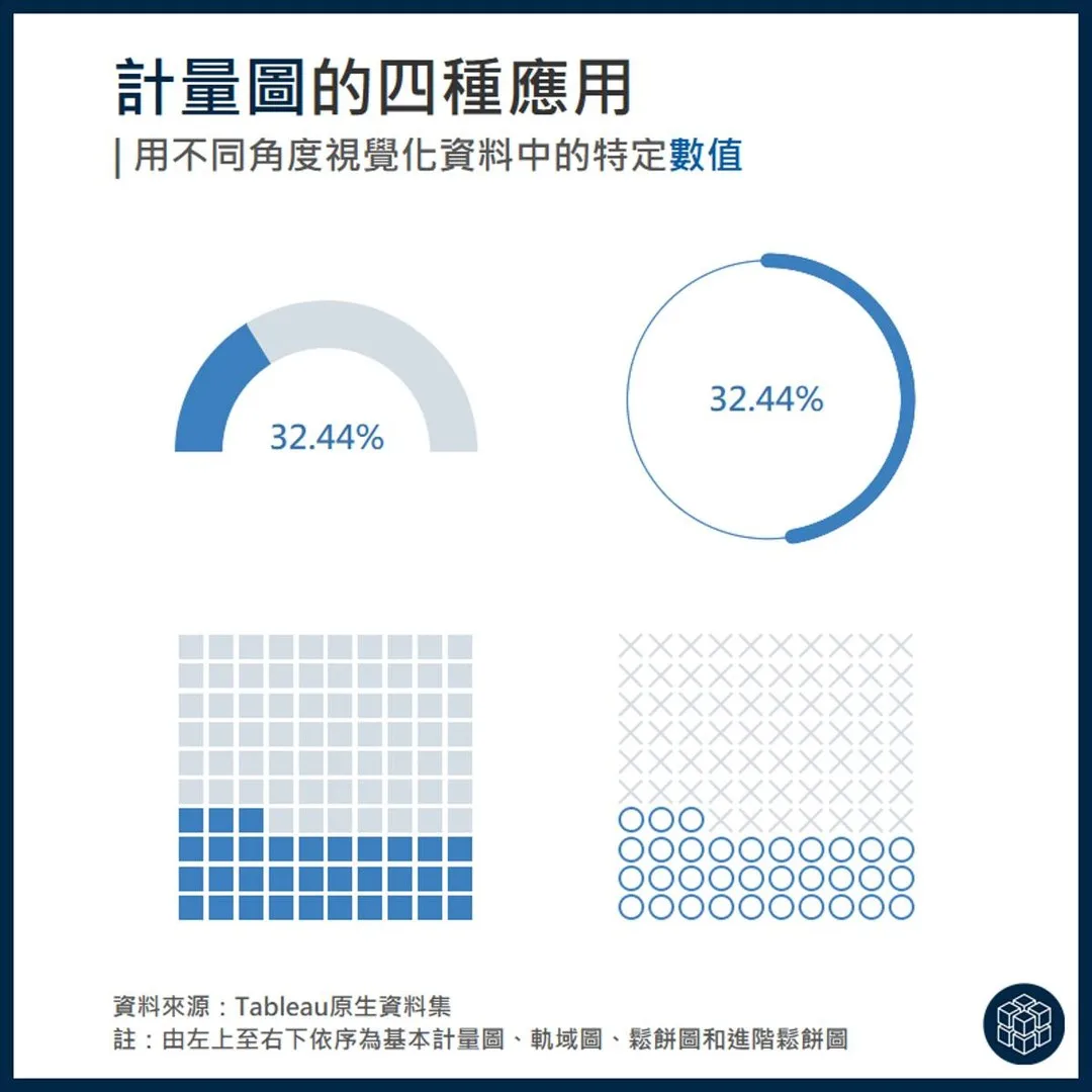
Gauge chart
Visualize a single value from different angles
Four common variants
Basic gauge, radial gauge, waffle, advanced waffle
Best for
When one ratio or completion rate is the message, e.g. KPI progress or a gender ratio.
Common mistake
Dozens of gauges become noise; for many items use a sorted bar chart.
Real example
Colleges with the biggest gender gaps
Combo charts
Combine shapes to explain richer stories
Four common variants
Bump chart, dumbbell, bullet-style bar, slope (meteor) chart
Best for
Bump for rank changes, dumbbell for gaps between two points in time, combined bars for actual vs target, meteor for direction of change.
Common mistake
Combo charts are dense — always add clear legends and labels.
Want all 40 charts?
The cheat sheet covers 40 charts across 10 categories with examples and use cases. Free with your email.
One chart a week
Follow ChartBar on Instagram to see these charts applied to real Taiwanese data.
Follow @chartbar0713Planning a session for your team?
Talks, half-day workshops and full-day programs on data storytelling, Tableau and AI tools.